'Sign in with Clio': Button guidelines for applications
Clio Identity is Clio's authentication service and identity provider. Similar to how you may see a "Sign in with Facebook" or "Sign in with Google" button when authenticating with an application on the web, third-party developers can leverage Clio Identity as an identity provider, cutting the time needed to write and maintain an authentication system for an application and streamlining account management for users.
This document provides guidelines for styling a "Sign in with Clio" button to ensure the button meets Clio's accessibility and brand guidelines, and allows customers to have a consistent experience across all services using single sign-on with Clio.
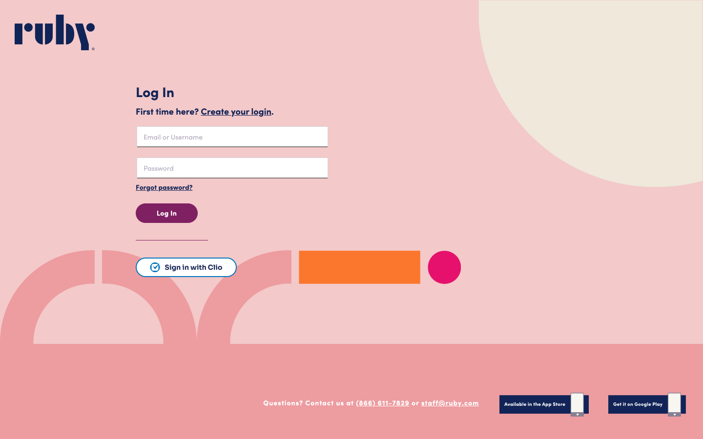
Example: Ruby's implementation of the "Sign in with Clio" button.
Branding Do’s and Don’ts
DO ensure the button you implement includes the Clio logo and the text "Sign in with Clio" or "Sign in with Clio (US)".
DO ensure the button colours have enough contrast with the background of your website.
DO ensure there's sufficient visual distinction between different button states, for the default button state, the hover state, and the focus state.
DO write explanatory text in addition to the text on buttons to help end users recognize if they can sign into your application. For example:
If you have a Clio account, you can grant <example_app_name> access to your organization’s data. This will allow your users to access <example_app_name> with their existing accounts.
DO customize the button styling to fit the look and feel of your application's branding guidelines.
DON’T use “Sign in with Clio Manage” or “Sign in with Clio Grow" as the button text.
DON’T alter or remove the Clio logo from the button.
Official Clio logo assets
Download any of these Clio logos for use in your app, right click on the one you want to save it.
| Blue logomark | Black logomark | White logomark | ||||
|---|---|---|---|---|---|---|
| SVG (recommended) |  |  |  | |||
| PNG |  |  |  |
Default "Sign in with Clio" styling
Visual guidelines
We do recommend all of our application partners to customize the look and feel of the button to create a more cohesive visual experience for end users. However, if you wish to use the default Clio branding for the "Sign in with Clio" button we have included 3 colour variations below.
CSS specification
See attached sso_button_example.zip for a complete example!
Blue Button Variables
:root {
  --text: #ffffff;
  --font: "Helvetica Neue", Helvetica, Arial, sans-serif;
  --default-state-background: #0070e0;
  --default-state-border: #0f478d;
  --hover-state-background: var(--default-state-border);
  --hover-state-underline: #a3dcff;
  --focus-state-shadow: var(--default-state-background);
  --focus-state-border: #ffffff;
}
White Button Variables
:root {
  --text: #011c37;
  --font: "Helvetica Neue", Helvetica, Arial, sans-serif;
  --default-state-background: #f5f7f8;
  --default-state-border: #dfe6e9;
  --hover-state-background: var(--default-state-border);
  --hover-state-underline: #011c37;
  --focus-state-shadow: #011c37;
  --focus-state-border: #ffffff;
}
Black Button Variables
:root {
  --text: #f5f7f8;
  --font: "Helvetica Neue", Helvetica, Arial, sans-serif;
  --default-state-background: #011c37;
  --default-state-border: #090909;
  --hover-state-background: var(--default-state-border);
  --hover-state-underline: #f5f7f8;
  --focus-state-shadow: var(--default-state-background);
  --focus-state-border: #ffffff;
}
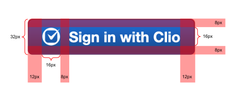
CSS for Buttons and Anchors styled as buttons
button, a.button {
  height: 32px;
  padding: 8px 12px;
  border-radius: 4px;
  border: 1px solid var(--default-state-border);
  background-color: var(--default-state-background);
  background-image: linear-gradient(-180deg, var(--default-state-background) 0%, var(--default-state-border) 100%);
  font-family: var(--font);
  color: var(--text);
  font-size: 13px;
  font-style: normal;
  font-weight: bold;
  align-items: center;
  display: flex;
  position: relative;
  box-sizing: border-box;
}

button:hover, button:focus, a.button:hover, a.button:focus {
  background-image: linear-gradient(-180deg, var(--hover-state-background) 0%, var(--hover-state-background) 100%);
}

button:hover:before, a.button:hover:before {
  content: "";
  border-radius: 0 0 1px 1px;
  border-bottom: 2px solid var(--hover-state-underline);
  position: absolute;
  bottom: 1px;
  left: 1px;
  right: 1px;
}

button:focus:after, a.button:focus:after {
  box-shadow: 0 0 0 2px var(--focus-state-shadow);
  content: "";
  border-radius: 4px;
  border: 1px solid var(--focus-state-border);
  position: absolute;
  top: -2px;
  bottom: -2px;
  left: -2px;
  right: -2px;
}

button img, a.button img {
  padding-right: 8px;
  height: 16px;
  width: 16px;
}

a.button {
  display: -webkit-box;
  display: -ms-flexbox;
  display: inline-flex;
  -webkit-box-align: center;
  -ms-flex-align: center;
  -ms-flex-pack: distribute;
  justify-content: center;
  -webkit-box-flex: 0;
  -ms-flex: 0 0 auto;
  -webkit-box-sizing: border-box;
  margin: 0;
  cursor: pointer;
  text-decoration: none;
  transition: all 0.1s ease-in-out;
}
HTML
<button><img src="clio-logo-white.svg" /> Sign in with Clio</button>

<a class="button" href="#"><img src="clio-logo-white.svg" /> Sign in with Clio</a>